Workflow was a scheduling app concept created at university way back in 2011, and as a result is obviously starting to look very dated. While there are many aspects of the design I would change today, one piece worth highlighting is the way we designed the timeline interaction. Instead of laying out information in a 2D timeline, which is limiting in a number of ways, we compressed information to fit in a flattened 3D interface.

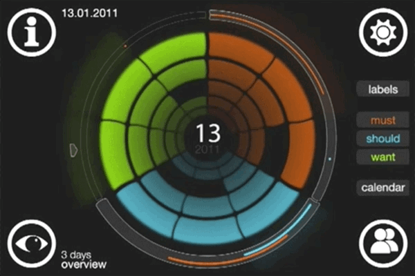
With Workflow, our team set out to create an app to help users better manage their time and productivity. We enlisted university students and young professionals to take part in a month long research phase that included frequent in-person interviews and online surveys to discover how people managed their time and tasks. Our team discovered the biggest pain points were prioritizing tasks, visualizing deadlines, managing unexpected new tasks and keeping up to date with collaborators. Instead of choosing a typical calendar format, which felt clumsy to navigate and difficult to measure progress, we created a 3D interface called the tube which allowed people to “scroll through time,” assign task priorities, and get an at-a-glance overview of current and past progress.